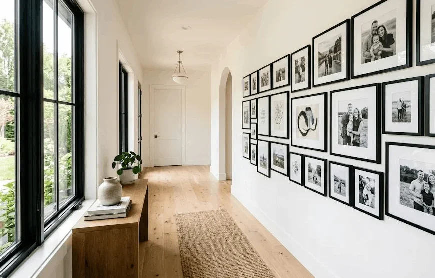
So you’ve got a blank hallway and a stack of photos sitting in a drawer somewhere. You keep thinking, “I should really put those up.” That’s basically how every hallway gallery wall project starts. You’re not alone if the idea also makes you a little nervous, because hanging a bunch of frames in a row can go wrong fast if you don’t plan it out first.
Here’s the good news. A hallway gallery wall isn’t actually that complicated once you know the few rules that matter. By the end of this, you’ll know exactly how to measure, space, and arrange your frames so the whole thing looks like you hired someone, even though you didn’t.
Why a Hallway Gallery Wall Works So Well
A hallway gallery wall works because it solves a problem most homes have: long, narrow stretches of wall that nobody knows what to do with. Living rooms and bedrooms get all the design attention, but the hallway just sits there, plain and forgotten.
What this means is your hallway gallery wall doesn’t have to compete with much. There’s no sofa, no rug, no coffee table fighting for attention. It’s just you, the wall, and the photos. That’s exactly why corridor wall art tends to have such a big visual payoff for relatively little effort.
On top of that, hallways are high-traffic. People pass through them daily, sometimes multiple times an hour. A photo wall layout placed there gets seen far more often than a piece of art tucked in a guest room nobody visits. That means your hallway gallery wall earns its keep every single day, not just when guests come over.
It also makes the space feel warmer, since a plain corridor can feel a bit cold and transactional, like it’s just there to get you from point A to point B. Add some frames, and suddenly it feels like part of the home instead of a leftover gap between rooms.
Pick Your Layout Style First
Before you buy a single frame, decide whether you want symmetrical or asymmetrical. This single decision shapes everything else.
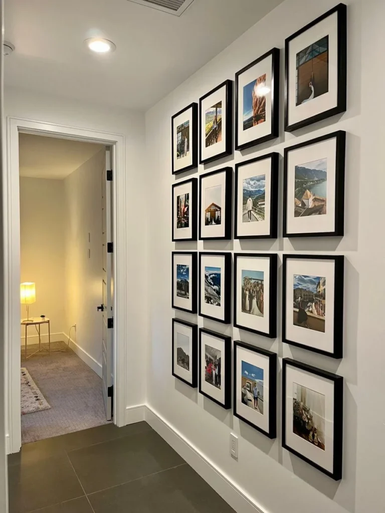
Symmetrical Layout
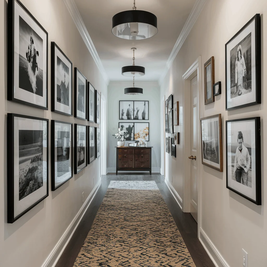
This is the safer choice if you’re nervous about getting it wrong. Same frame size, evenly spaced, straight lines. It reads clean and calm, which works well for a more formal entryway wall decor look. It’s also the easiest option to plan ahead of time, since you’re not juggling a dozen different frame sizes and trying to make them all play nice together.
If you’ve got a tighter budget, this approach helps too, because buying matching frames in bulk is usually cheaper than collecting a bunch of different ones. The only downside is it can feel a bit predictable if your hallway is already pretty plain, so adding one slightly different element, like a small shelf or an odd-shaped frame, can keep it from feeling too stiff.
Asymmetrical Layout
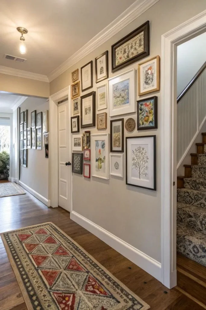
This is the salon-style, mixed frame gallery layout you’ve probably seen on Pinterest. It looks more personal and collected over time, but it does take longer to plan since there’s no template to copy. If you go this route, give yourself patience. Designers who do this professionally say it’s normal to keep adjusting for weeks before it feels right.
A hallway gallery wall done this way tends to feel more like a story you’re telling, since each piece can come from a different trip, era, or person in your life. Just don’t rush it, because the best asymmetrical layouts usually come from small tweaks over time, not one perfect attempt.
Measure Before You Touch a Single Nail
Here’s why this step actually matters. A hallway gallery wall that ignores the wall’s real dimensions almost always ends up looking off-center or cramped on one side.
Start by measuring the full length and height of your wall. Note where light switches, doors, and thermostats sit, since you’ll need to plan around them. Most designers recommend keeping the center of your gallery between 57 and 60 inches from the floor. That’s roughly eye level for most adults, which is why it’s become the standard for nearly every photo wall layout you’ll find online.
Getting this measurement right early on saves you from having to redo your entire hallway gallery wall later, which is a lot more frustrating than spending an extra ten minutes with a tape measure now. Write down your numbers somewhere you won’t lose them, since you’ll likely reference them a few times while you’re arranging frames and double-checking spacing.
Use the Paper Template Trick
If you’ve never done this before, this one tip alone will save you from extra holes in your wall.
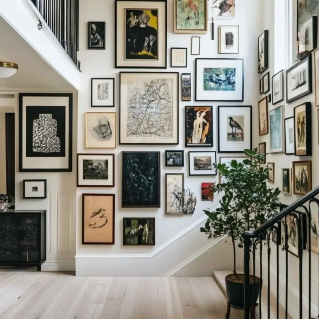
Cut out paper templates matching the exact size of each frame. Tape them to the wall in your planned arrangement, step back, and look at it from a distance. Adjust as needed before you commit to anything permanent. This is especially useful for staircase wall decor, where you can’t lay frames out flat on the floor first because of the angle.
It also helps to take a photo of the taped-up layout on your phone, since seeing it in a picture often reveals spacing issues your eye misses in person. Live with it for a day or two if you can, walking past it a few times before you start hammering in nails, just to make sure it still feels right once the initial excitement wears off.
Get the Spacing Right
Spacing is where most hallway gallery wall attempts go wrong. Too tight, and it looks cluttered. Too loose, and the pieces feel disconnected from each other.
The general rule that shows up again and again from professional decorators is simple: leave about 2 to 3 inches between frames. It’s not a strict law, and a little inconsistency actually looks more natural, but staying in that range keeps your wall art arrangement from feeling chaotic.
For example, if you’re working with a narrow hallway, tightening that gap slightly can help the wall feel less busy, since narrow spaces already feel tighter just by nature. A hallway gallery wall in a tight corridor benefits from this small adjustment more than people expect, since even half an inch of extra breathing room can make the whole thing feel less stacked together.
If your hallway is wider, you actually have a bit more freedom to loosen the spacing slightly, which can make the layout feel more relaxed and intentional rather than tightly packed.
Mix Frame Sizes the Smart Way
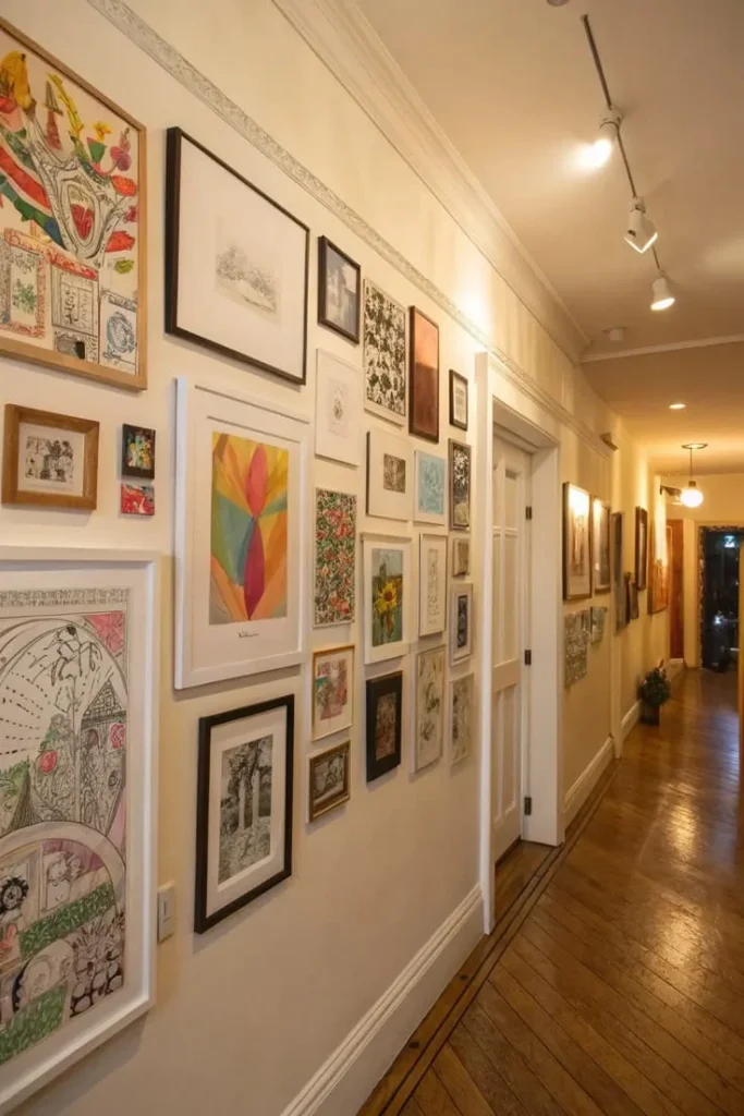
A frame collage display doesn’t mean grabbing whatever frames you already own and hoping for the best. Pick two or three sizes and repeat them throughout the layout. This creates rhythm without looking matchy-matchy.
A common combination that works well: one larger anchor piece, paired with several mid-size frames, and a few small ones to fill gaps. Crate & Barrel’s design guide suggests filling smaller leftover spaces with 3×3 or 4×6 frames, which is a handy trick if you’re staring at an awkward gap after hanging the bigger pieces. This kind of size mixing is what gives a hallway gallery wall that collected-over-time look, instead of feeling like everything was bought in one matching set.
It also makes the layout more forgiving, since you don’t need every single piece planned out perfectly before you start hanging things up. If you end up with leftover wall space once the main pieces are up, that’s actually normal, and it’s exactly where those smaller filler frames come in handy.
Don’t Skip the Color Coordination Step
This part gets overlooked constantly. Your hallway gallery wall doesn’t need every frame to match exactly, but having some kind of unifying thread makes a huge difference.
That could mean:
- All black or all white frames.
- A mix of wood tones that feel intentional.
- Black-and-white photos only, for a cleaner look.
- One accent color repeated across a few pieces.
Without this, even a well-spaced wall art arrangement can feel like a random pile of mismatched stuff. A hallway gallery wall needs that visual thread to tie everything together, otherwise even perfectly measured spacing won’t save it from looking thrown together.
Think of it like an outfit, where you can have great individual pieces, but without some kind of common color or style, nothing quite feels put together. Once you lock in that one unifying element, even mismatched frame sizes and random photo subjects start to look like they belong on the same wall.
Think About What Goes On It
Family photos are the obvious choice, and a family photo wall is still one of the most popular reasons people start this project in the first place. But don’t feel locked into only photos.
Mix in things like:
- Travel prints or postcards.
- A small mirror to break up the photo pattern.
- Picture ledge shelf display shelves instead of traditional hanging, which makes it easy to swap items without new holes.
- A meaningful object, like initials or a small piece of memorabilia.
This kind of variety is what turns a basic photo wall layout into something that actually feels like you. It’s the difference between a wall that looks nice in photos and one that actually means something every time you walk past it.
Don’t be afraid to include a piece that doesn’t perfectly match the others if it has real sentimental value, since those slightly out-of-place items often end up being the ones people ask about. At the end of the day, this is your hallway, so let it reflect the things you actually care about instead of just what looks good on Pinterest.
Watch Out for the “Too Crowded” Feeling
A real problem people run into, especially in narrower homes, is that a hallway gallery wall can suddenly make the space feel tighter than it did empty. One homeowner described feeling like she had to lean away from the wall just to avoid bumping it, even though the frames barely stuck out an inch.
If your hallway is on the narrower side, consider thinner frame profiles, or stick to one tighter row instead of a wide, sprawling arrangement. Sometimes less really is more here. A simpler hallway gallery wall can still pack a lot of visual interest without making the space feel like it’s closing in on you.
If you’re really tight on width, even a single line of frames running the length of the hallway can look intentional and polished, rather than sparse or unfinished. It’s worth resisting the urge to fill every inch of wall, since a little breathing room often reads as more thoughtful than a completely packed layout.
A single row also makes future updates much easier, since you can swap out one frame here and there without having to rethink the whole arrangement. If you’re ever unsure whether a layout feels too sparse or too packed, take a step back and view it from the far end of the hallway, since that’s the angle most people will actually see it from day to day.
Staircase Walls Need a Slightly Different Approach
If your hallway gallery wall runs alongside a staircase, the rules shift a bit. You can’t always view the whole thing at once, since you only really see it fully from the top or bottom of the stairs. Designers often suggest following the angle of the stairs with your frame placement, rather than forcing a straight horizontal line, since it feels more natural to the eye as you walk up or down.
This staircase wall decor approach also means your spacing needs to account for the step pattern, so measuring from each stair tread rather than the floor below tends to give more consistent results. Keep in mind you’ll be viewing most of these frames while in motion, so slightly larger pieces or bolder images tend to read better than tiny, detailed photos you’d need to stop and study.
If you’re unsure where to start, anchor your first frame near the bottom or top step and work outward from there, rather than trying to plan the whole staircase at once. This gives you a fixed reference point to build from, so the rest of the layout follows naturally instead of feeling like you’re guessing at every new frame placement.
Once you’ve got two or three frames up and spaced well, step back and check the angle again, since small adjustments are much easier to make early than after the whole wall is filled in.
A Few Things Worth Double Checking
Before you start drilling, it helps to confirm you’re not violating anything structural, especially in older homes or rental units. The U.S. Consumer Product Safety Commission has general guidance on safe wall-mounted decor weight limits, and Google’s own Search Central guidance on helpful content is a good reminder that this kind of practical, specific advice is exactly what readers (and search engines) are looking for over vague fluff.
If you’re renting, check your lease terms before making permanent changes, since some buildings have specific policies on wall modifications. It’s also worth using a stud finder before hanging anything heavier than a standard photo frame, since drywall alone won’t always hold the weight over time. A few extra minutes spent checking these details now can save you from patched-up holes, landlord disputes, or a frame crashing down months later.
FAQs: Hallway Gallery Wall
How high should a hallway gallery wall be hung?
Keep the center of your arrangement around 57 to 60 inches from the floor. That’s roughly eye level for most people and is the standard most designers use for any hallway gallery wall, regardless of ceiling height.
How much space should be between frames?
Aim for 2 to 3 inches between each frame. It doesn’t need to be perfectly even everywhere, but staying close to that range keeps the layout looking cohesive instead of scattered.
Can I do a gallery wall in a narrow hallway?
Yes, but go smaller. Use a mini version with smaller frame sizes and tighter spacing so the wall doesn’t make the space feel even more cramped than it already is.
Do all the frames need to match?
No, but they should share something, like color, material, or a consistent photo style. That shared thread is what keeps a mixed frame gallery layout from looking random.
What’s the easiest way to plan the layout before hanging?
Cut paper templates the size of each frame and tape them to the wall first. Step back, adjust as needed, and only commit to nails once you’re happy with the arrangement.
Conclusion
A hallway gallery wall really comes down to a few decisions: pick your layout style, measure properly, keep spacing consistent, and choose frames that feel connected to each other. None of it requires special skills, just a bit of patience and a willingness to adjust before you commit to anything permanent.
If you’ve been putting off that empty hallway for months, this weekend is as good a time as any. Pull out those paper templates, tape up a rough layout, and see how it feels before you pick up the drill.